 The more I look at good web design, the more I realize that it is the subtle, often glanced over details that absolutely make a site’s overall design “work.” I have recently become enamored at the variations in image frames and thumbnail images across the web and their ability to greatly contribute to the look and feel of a page. Forget the 1px solid borders. Get creative!
Here are a few of my favorite examples!
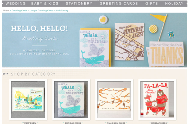
These image frames at Hello Lucky are just to die for. The use of inner shadows creates a classy, set-in look. The best part? They’re made using some images, and some CSS3!
Look at these lovely little shadows at The Paper Damsels site. They are so small, but add depth to the page.
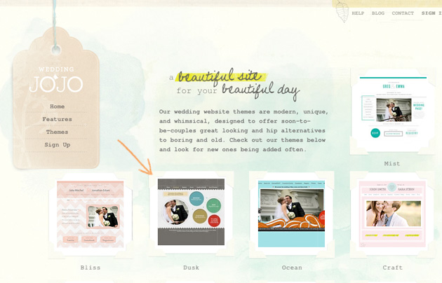
Head over heels for this look of vintage image corners at Wedding Jojo.
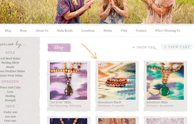
 Drool. Look at these organic, torn looking thumbnail image frames at the shop at LovelyTinyDevotions.com.
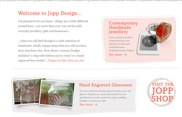
I’m also totally in love with these imperfect, handdrawn frames that add so much interest to the homepage of Jopp Jewelry.
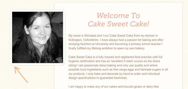
How about these nice image frames at Cake Sweet Cake’s site?
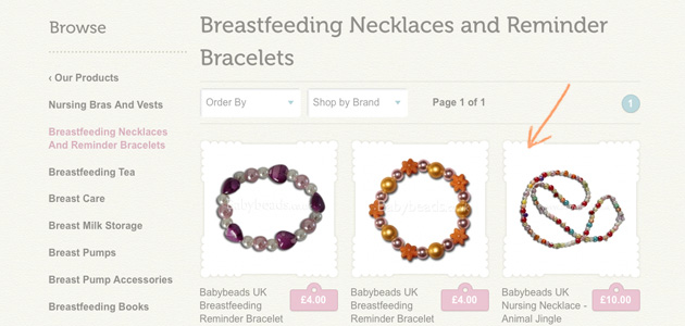
How about these adorable frames used in the gift shop at Boob Baby?
These asymmetrial image frames match the overall geometric feel to the design of the page at 826Chi.
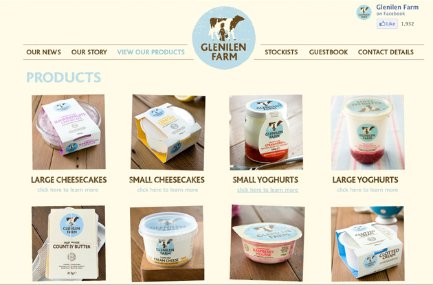
This assymetrical style can also have a cute, quirky, homey feel to it. As in the product thumbnails at Glenilen.
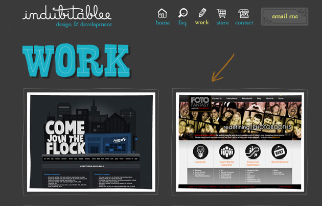
Love the gal at Indubitablee’s approach to web design. And these nice hand-drawn image borders consistent with the style of her site.
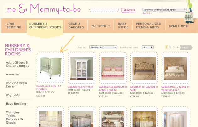
How about these cute image thumbails at the shop at Me and Mommy to Be? Certainly keeps with the overall child-like design.
What’s not to love about these cool image borders at Goatee Joe?
What about these awesome, dimension-adding shadows at Taiyab.co.uk?
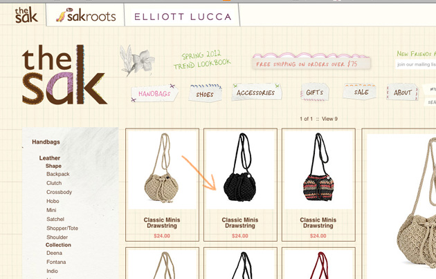
What about this easily achieved (using plain old CSS) style of image frames at the Sak?
Here’s a simple look for some thumbnail images at Shoplocket.
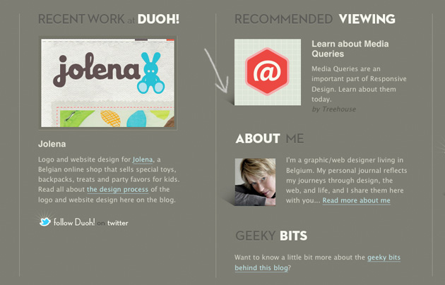
And to end with a bang. Everyone’s design hero, Veerle Peiters uses some interesting subtle shadows to create depth on the thumbnail images in her footer.
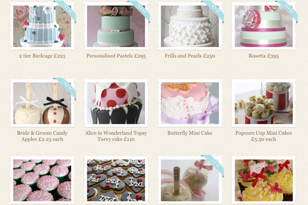
These lovely, slightly torn image frames are so lovely. But when you’re featuring a bunch of scrumptious cakes like The Little Cake Parlour whats not to like?
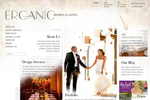
How about these seemingly hand-painted borders on Erganic Design.





Some cool examples here! Thanks for sharing.
Thanks!
will you be making this type of layout soon???
Web design should have its own distinctive characteristics, I prefer a simple and fresh tone, you can refer to cucukids for details, I think from the website logo to the overall design are very good.