If you’ve just purchased your domain, purchased hosting, have installed WordPress, uploaded your favorite feminine wordpress theme (Harmless plug!) and are ready to get things customized to your liking and looking just right, this post is for you.
Here are 10 common WordPress blog design mistakes that I see beginners (And even seasoned) WordPress bloggers make that really have become a pet peeve of mine and should be avoided if you want your site to look professional.
1. Comment Forms on EVERY PAGE
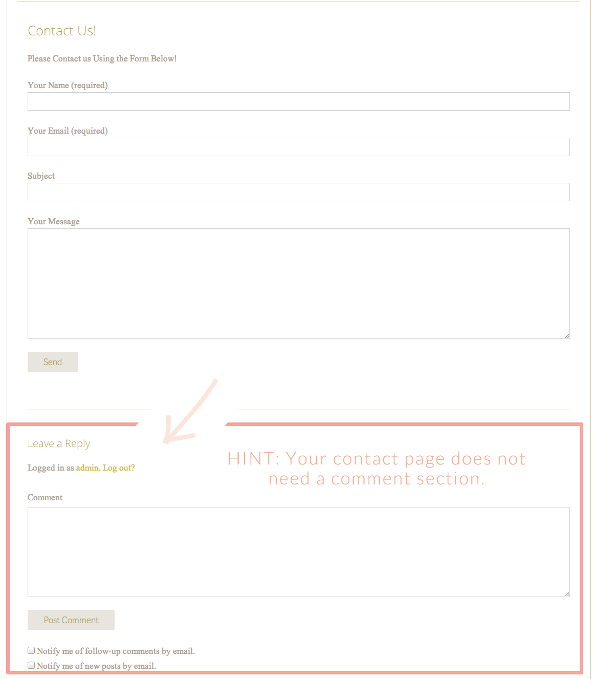
If I had to choose a cardinal WordPress sin, I think this would be it. By default, WordPress is intended to be a blogging platform so the Comments / Pingbacks box shows up on every page. But do people really want to leave a comment on, say, your contact form page?
“Dude, sweet contact form!”
“OMG! I just LOVE this contact form”
Umm…Not exactly. Let’s keep the comments on blog posts where they belong.
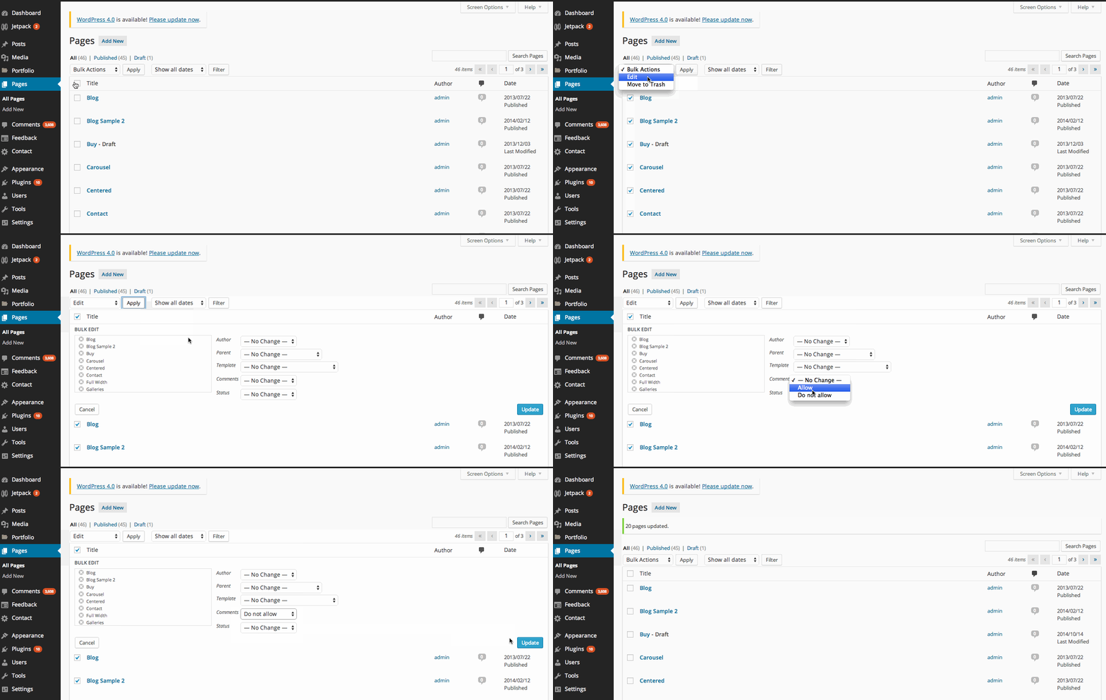
Here’s how to quickly remove the comments from your pages by bulk editing them.
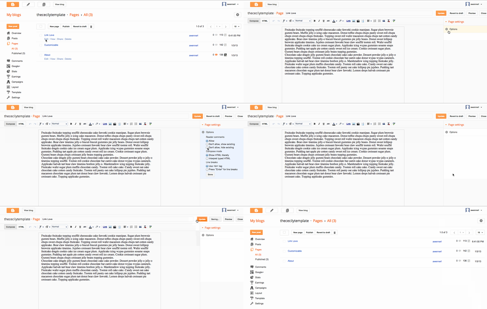
And for my blogging friends using blogger, here’s how to remove the comment form from your pages:
2. Sidebar Clutter
Your sidebar is a great place to feature your most popular posts, and call to action buttons. Ask yourself what you really want your users on your site to do. Subscribe to your newsletter? Follow your Pinterest boards? Browse your shop? Whatever action you want your site visitors to take should prominently display at the top of your sidebar.
*Sidenote: I know you’re trying to monetize your blog with ads… but please use them as sparingly as possible. Overusing ads can really turn users off to your site and increase your bounce rate.
*Second Sidenote: If you have a ton of badges you want to display, narrow it down. You don’t have to cram them all into your sidebar. Focus on what is important and necessary to display.
3. Font Overkill
I know. It’s so hard to hold back on your font choices when there are So. Many. Good free ones to choose from. And especially when you can upload your own custom fonts like our themes allow. But do yourself and others a huge favor and stick to 2-3 fonts at a maximum used in your site text. Why? Because it is VERY easy to go overboard and create a cluttered looking site. Certainly you can incorporate images with some varying fonts, but if you want your site to look professional, you really need to reign in the number of fonts you use. Oh, and while you’re at it… find some Google font pairs that look good together!
4. Header Graphics Overkill
Less is more. Like choosing too many fonts, going overboard with graphics, colors, and design elements can be a big detraction from your site’s actual focus and content. This is a true sign of a newbie blogger. Just because you find some great free clip art resources, fonts, and photoshop brushes… hold back! Choose one or two simple elements that represent your brand to use in your header. Then, let your content sing off the page. Use those extra free graphics you fall in love with for your blog post images. *Note, I could link and insert some pretty good bad examples here, but I don’t want to make any internet enemies. :)
5. Visual Heirarchy
If anything is important for your blog posts and pages, it is this! Let your reader follow the flow of your text naturally by using your header tags (H1, H2, H3, etc) from within your WordPress text editor. (Bonus: This is really good for SEO). Make lists when appropriate. Bold, underline, and italicize things so that there is a natural flow for your readers. Use divider lines.
6. Plugin Smorgasbord
Again less is more! The more plugins you install in WordPress, the more chances there are that something will conflict, causing code bugs, and things to fail to work as expected. I have helped countless of our cute WordPress theme users who have something go awry only to find a silly plugin causing an issue. Take a look at our recommended and favorite plugins for WordPress here. Oh, and sometimes installing too many of the wrong kinds of plugins can cause your site to load slowly. Which reminds me…
7. Uploading Too Large Image Sizes
I have seen too many photographers and bloggers who think that the bigger the image they upload, the better. Not true! In general, you want to upload an image that will fill your content area… no larger. Large images cause your site to load slowly. A slow loading site means your visitors will bounce away and never come back. Sad day! Upload images that are just the right size. And if you want a plugin that will automatically squash huge files upon upload, see this one!
8. Readability
This one’s pretty straightforward. Use fonts and font sizes that are optimal for readability. Choose colors that can be easily seen on a variety of monitors. (Tip! Go to Best Buy and pull up your website on a bunch of different computers. You may be surprised at how various colors are rendered on different viewing devices!) The debate is still waging as to whether sans-serif or serif fonts are the way to go for readability body texts. Be mindful of the fact that some of your users will be viewing on mobile devices as well. The key here is to really test how your site looks.
9. Images That Don’t Fit The Post Area
This is probably the second most common WordPress Blog Mistake and maybe you don’t even think it’s a mistake. You upload pictures that are too small to fit your post content area. Or, your pictures are all different widths which creates a pretty inconsistent look.
In my opinion, this can make things look untidy really quickly. The solution? Make sure you’re uploading images that are wide enough to fill your posting area. The width of your posting area will vary depending on the blog theme you’re using (*Hint, our themes let you set the content width to whatever you like.) If you have images you want to incorporate, use an image editing software like PicMonkey or Photoshop to create collages of images if you want to use several that are too small. Or, use a mosaic image gallery in a post. (Our themes come with these built in galleries!) *Also, I realize that many folks are now inserting narrow images because they are better suited for pinning. Why not put a couple of those bad boys side by side to fit your content area?*
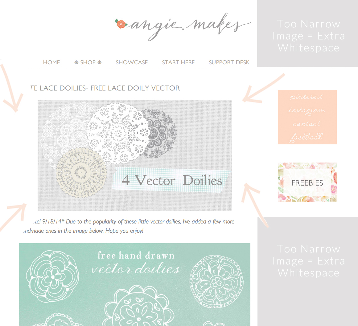
*Ahem, yes I realize I am using a page from my very own site to illustrate something you should try to avoid doing on your own site. This is a super old post whose images were designed 2-3 blog design revisions ago. Still, if this was my #1 popular post, I really should go back and edit it.
So, what about you? Do you have any blog design pet peeves? Cardinal sins that drive you bonkers when perusing the internet? Share ’em below!

Great tips Angie. I’m going to review my site to make sure I’m not making any newbie mistakes. Thank you.
Oh good! I’m glad you found them helpful. :)
Fabulous tips! Especially #8 – Readability. I can’t tell you how many times I find myself straining my eyes trying to read a blog post because they’ve chosen a very fine font with small text size in a very light color. Drives me almost as crazy as those who embed music into their site & I can’t easily locate how to turn it off.
Oh my gosh! So true. Music on a website makes me want to kick a puppy.
Especially if it’s a song I don’t like.
HAHA Dude, nice comment form! Cracks me up!! Great tips and all so true.
Thanks so much for the tip on removing unnecessary comment forms on every page! That was driving me nuts and I had no idea how to remove them… until now!
Allison,
I know right?! Easily my biggest pet peeve. So glad to have helped!
Thank you so much, I have been trying to figure out how to get rid of the comment forms on all my pages. All done now, Thanks again.
Wendy,
Oh yay! Glad you found it helpful. :)
You are really great and found your website. I have bookmarked – will probably put it on my Daily reads – thanks for all the wonderful advice, you are so helpful!
Chiara
http://www.that-spark-of-light.com
Chiara,
Thanks so much. Glad you found me. :)
Great post. GREAT. I hate clutter. However, I do find the pale gray text colors hard to read and they are here and everywhere. Thoughts??
Giada,
I know what you mean about gray. The thing about ALL colors on the web is that they can show up great on one computer but look dull on the next. It has to do with your monitors resolutions / color rendering. If all the grays are looking dull, try to make a few adjustments under your monitor settings.
What on this site are you finding hard to read? I’ll have to give it some attention.
Thanks for your comment btw!
Thanks for all of these great tips! I really like the way you have used divider lines in this post (as you mentioned in the #5 tip). Do you just use the underline key on the keyboard to accomplish this or is it a feature? I have blogger (which may not have this option).
Hi there! We actually have a shortcode that makes inserting dividers… solid, dotted, dashed, and image dividers a breeze. I’m not sure with blogger! You could always create and insert a divider image though!
So glad I found this. I’ve been clicking around reading and learning SO much. I came back to this post to start with this question: My photos usually fill the page area but is it possible that the file size is too large and slows down my site. How would I know? How do I know what size my photos need to be? I’ve resized some on Picmonkey and I use square photos alot since those seem to work best on social media (I think). Thanks for your help.
Stacy,
GREAT question! Yes, ok. So you’re right in that the large files can often bog down your site. Try running this plugin. I LOVE it. It basically squashes super ridiculously sized images to better sizes.
https://wordpress.org/plugins/imsanity/
To figure out what size your images need to be, it depends on the width of your posting area. Hmm. You can always right click the image, in google chrome you can hit inspect element to find the width. That might make a good blog post actually! :)
Definitely making a couple newbie mistakes – thank you for helping me learn how to rectify them!
Mimi
http://thisdomesticateddiva.com
Thank you! Your site is just the help for which I’ve been looking!
Thanks for the great advice! I just created my blog the other day and I’m definitely taking these tips into consideration through out my design process!
Hooray! :)
Thanks for the tips! I’m new to blogging and I’m SURE I’m making some of these errors. I’m currently trying to figure out if it would be easier to navigate and set up an attractive blog if I paid for a theme instead of using a free one. I’m assuming it would be?
Hi Lisa!
I’m sure you’re doing great. Everything is a learning curve at first and WordPress is no exception. :) That said, you got this! Just dive in. You can do it.
The difference between a paid theme and a premium one is mainly ease of customization and extra bells and whistles, etc. I wrote a blog post detailing that recently. Maybe you’ll find it helpful!
http://angiemakes.com/is-your-wordpress-theme-hot-or-not-meet-the-wordpress-customizer/
Everything takes some time to set up, but I think the Customizer options make it easier for beginners.
bless you! Those silly comment forms drive me crazy!!!!
Thanks for the tips. After reading this, I realized that I was making 50-60% of the mistakes, working on it right NOW!!
Angie? Holy #$%@!! You just totally saved me! I have been pulling out my hair with this space between words thing. Shift enter? Holy grail if you ask me!!
Just one question. I think I did it the hard way. In a nutshell I kept copying and pasting so I could hit shift enter to make the paragraph look right. But is there an easier way to do the bullet point approach in a blog? I had already written my blog and had to go back and rewrite some of it after finding your site.
Thanks!
Joanna
Lovely!! Thank you! ????
Thanks for very useful tips!
I just want to indicate a minor spelling correction. Hint #6 should be spelled “SMORGASBORD”. The swedish word “smörgås” means “sandwich” and “bord” means “table”. “Borg” on the other hand is a perfectly valid swedish word but it means “castle”. So a SMORGASBORD is in essence a buffet or “a table with many dishes”.
I never even thought about deleting comment forms from my pages. I just did it though, and it does look much better!
Thanks so much for these tips, I am going to go touch up my blog now thanks!
I am so glad I found this post. I had never thought to go to someone elses computer to look and see what my blog looked like. Thank you for sharing.
It took me a long time to realize that you could remove comment forums from other pages. I think it declutters your overall blog as well. This is really useful, thanks for sharing. I like the wordpress platform a lot and I don’t think I’ll be leaving it soon.
thank you so much i will chek out my blog asap :)
if you want you can chek out mine and tell me if you have any recommendation
kayvanity.blogspot.ca
I’m a newbie and I make mistakes. It’s all part of the rich tapestry of learning.
Hey Angie! I really like your theme, but when I tried to upload it, it said there was an error and that the style.css stylesheet is missing. Do you have any advice? Thanks!
Than you for all of these awesome tips and “mistakes”. I am in the m midst of an exhausting rebranding process of both my webshop and blog (pretty much my entire Universe), and this was super helpful.
Thank You,
Charlie Ranger (@aholicbycsd)
Hi,
I’m just wondering if the 1. COMMENT FORMS ON EVERY PAGE fix is still current? I’ve followed it and it doesn’t seem to work.
Thanks in advance,
Carolyn
Lazer Epilasyon Yüz günümüzde hızla gelişen teknoloji, güzelliği ve bakımlı olmanın altın yöntemlerini avuçlarımıza bırakıyor.
Temel hedefimiz etkin olarak uygulanan ve sürekli geliştirilen yönetim sistemimizle başta peyzaj, çevre düzenleme ve inşaat faaliyetleridir.
Perfect blog posting for me. I recommend this blog for reading. Follow the link https://trendmoversdubai.com/
Gracias amablemente, he estado tratando de resolver alguna forma San Miguel escorts de eliminar las estructuras de comentarios en la totalidad de mis páginas.
This is a very good post. I am really thankful to you. https://www.nightangels.in/escorts/bangalore Keep sharing with us.
Metro shoes offer their customers the highest quality men sports shoes, wallets, Get the best available mens sandals in Pakistan.
Sifa provides wide range of Pakistani party wear dress, which is making your outfit gorgeous and delightful. Grab your favorite party wears dresses online in all over Pakistan at low prices with fast delivery.
Complete your outfit with the best leather belts. Servis offers the best quality leather belts online in all over Pakistan. Get your favorite belts online at reasonable prices.
Belive is online clothing store for men and women in Pakistan give the best online shopping experience and offer the biggest range of branded designers T shirts, Jeans, trousers, legging, and jumpsuits dresses.
Hive Metrics is the digital marketing agency that provides social media, technical services, and more. We focus on quality design, creative thinking, strong knowledge, standard practices, and progressive technology to develop distinctive solutions. Contact us today to learn more about what we can do for you!
Discover the latest ladies dress design for women online at Jazmin. Grab your latest design in all over Pakistan at reasonable prices.
At Safwa, we offer a wide range of suits for men and women with a variety of styles and prices. Our branded 3 piece suit in pakistan is of the finest quality and you can see it for yourself by viewing our website at safwabrand.com. The three pieces are a shirt, matching trousers, and matching jacket with two buttons on the front closure. Hats off to the new season in style!
Buy Online Scent Essential Niche Perfumes and Fragrances with original and unique quality in all over Pakistan at reasonable prices with fast delivery. you can also find some amazing options in Buy Online Best Niche Designer Attar Perfumes, Scent Reed Diffusers, Burner and bakhoor, Car Air freshener diffusers. ✓ Long Lasting, ✓ Pure ➤ Shop Now!
Luxury Women’s Designer shoes online shopping in Pakistan PinsStep provides a hassle-free e-shopping experience and ensures unmatchable Women Shoes Price. Our main focus is to satisfy customers by providing them authentic and genuine products. From Big to Small available all Sizes: 35,36 to 42,43,44,45 (Customize – Made to Order)
One of the most common mistakes is that using too many different colors and fonts can make your interface confusing and annoying. You should choose a harmonious color palette and some simple fonts to ensure consistency in the design of the blog.
The overall theme is “less is more” when it comes to design elements, fonts, plugins, and graphics. The focus is on creating a clean, professional-looking site that enhances user experience and readability.
This article on computer network assignment help is incredibly useful! It offers great insights into how expert support can enhance understanding of complex concepts. For anyone struggling with assignments, I highly recommend seeking assistance. If you’re looking for more resources, check out my assignment help for computer network assignment help available!
“Hi, I’m Isabella Lorenzo. If you’re facing an issue withHP Support offers reliable help for all your HP devices. We can assist you with troubleshooting, software updates, and repairs. We can ensure your devices perform their best when available online and by phone. Trust HP Support for quick and dependable solutions, ensuring your satisfaction and productivi
NGO Expert makes Section 8 Company registration simple and efficient. Their expert team guides you through every step of the process, ensuring compliance with legal requirements. Whether you’re starting a non-profit or expanding your organization’s impact, NGO Expert provides the support you need to successfully register and operate under Section 8 of the Companies Act. Highly recommended!
Taxlegit proudly holds ISO certification, a global standard for quality management systems. This certification underscores our commitment to delivering exceptional tax and accounting services, adhering to rigorous international standards. By achieving ISO certification, Taxlegit demonstrates its dedication to customer satisfaction, continuous improvement, and operational efficiency. Our clients can trust that we follow best practices in every aspect of service delivery, ensuring accuracy, reliability, and compliance with the highest industry norms. With ISO certification, Taxlegit reinforces its position as a leading provider of trusted and professional financial solutions.
Taxlegit proudly holds ISO certification, a global standard for quality management systems. This certification underscores our commitment to delivering exceptional tax and accounting services, adhering to rigorous international standards. By achieving ISO certification, Taxlegit demonstrates its dedication to customer satisfaction, continuous improvement, and operational efficiency. Our clients can trust that we follow best practices in every aspect of service delivery, ensuring accuracy, reliability, and compliance with the highest industry norms. With ISO certification,
It’s an informative content. You are the one who shares top level of blog with all of us. Thanks for sharing such a unique post. I hope North Goa escorts you will shared some more post very soon.