Today I’m introducing a new series around here called “Design a Blog Header that Will Make People Like You.” Why? Because we all want a nice, fancy, blog header… and for people to like us of course. And not all of us are professional designers so we could use a little input here and there.
I’ll be going over some examples of the good, bad, and ugly when it comes to blog header designs, as well as covering some pretty basic graphic design fundamentals. Don’t worry, it will be VERY basic. Think graphic design for dummies.
I hope to provide at least a handful of insightful tips so that you can feel confident and empowered to fire up Photoshop or click around in Picmonkey to create a header that is an expression of your brand, voice, and that’s, well, you. Alternatively, and for those of you who are just short on time, check out some of our premade logos. These provide a quick solution to making a blog header in not time.
Now, for the ugly.
Flashback. It was 2010 when I decided I wanted to start my very first blog. I was beyond pumped to purchase a domain name, fire up WordPress and work on the design. I remember logging into WordPress for the first time and hammering away on the 2010 theme to customize it to my liking. And I also remember being REALLY proud of my logo. Wait for it… you may want to pin this…
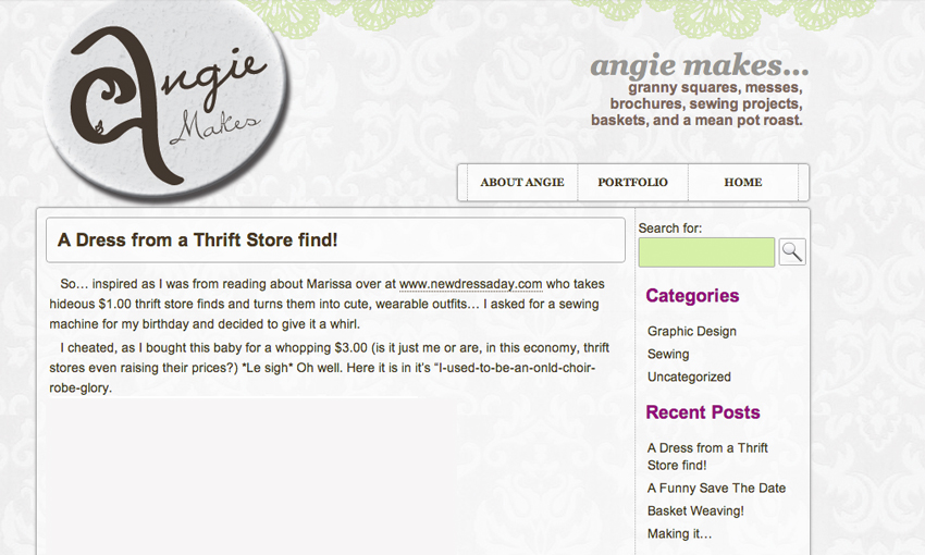
I know right?! Brilliant.
Or far from it.
The logo is supposed to look like a girl with some hair and lipstick. I was really into researching clever logo design at the time and wanted to incorporate some negative space and have it make people see the “A” wait… a girl… no, an “A.” Instead, when I showed it to a friend he said… “I see a wave and a seashell” (What were supposed to be hair and lips.) Sigh.
So let’s talk about what can and often does go wrong when designing a header for your blog and everything I did wrong as a rookie.
Common Blog Header Design Mishaps
1. Trying Too Hard to be Clever
Everyone wants to make a killer impression with their blog header. They want something memorable, unique, and stylish. The problem is, that can lead to trying too hard to make something that is overly complex. For instance, I should not have tried to make the “A” into a person. That’s trying a little too hard. A better solution would have been to keep the “A” text in a regular font choice and to somehow incorporate the silhouette of a woman’s head… if that’s truly what I was going for. Don’t over complicate things. People won’t get it.
It won’t be the first or the last time I’ll say this. Keep it simple.
2. No Hierarchy
Hierarchy is basically a way of organizing things in a way that makes sense… with the most important element first in a bold color or size that lends itself to prominence and a place of importance. Other elements take their respective place in the visual hierarchy. So what’s wrong with what I designed? First off, the logo and the text to the right of it are vying for competition in the visual hierarchy. Why did I display my brand name twice? Who knows. As a result, the menu is not prominent enough.
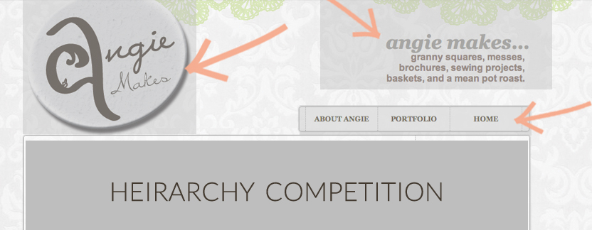
Make sure users can quickly find the hierarchy to the structure of your header area. Or in other words… don’t make them have to think about it! It should feel natural.
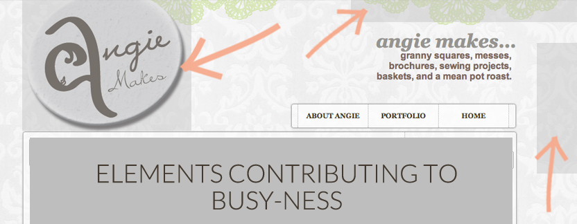
3. Busy-ness
There is a LOT going on with the lovely damask background pattern and repeating lime green lace at the top of the site. Add to it an trying-to-be-too-cute logo and you’ve got the perfect recipe for blog header design disaster. Let the main focus of your blog be your content… not busy, distracting design elements. Again, keep it simple people!
This concludes a little overview of my own design mishap made years ago. Stay tuned for the next posts in this series that will cover the basics of a good blog header design including:
– How to Use Color
– Incorporating Blog Graphics
– Repetition
– The Technology. How To Make a Blog Header (That Will Make People Like You) in Photoshop + Picmonkey
Hope you find this little series helpful!
Hi Angie, thanks for posting this article is really helpful for newbie like me c:
A blog header is always a risky proposition, but add in a logo that tries too hard to be driving directions attractive, and you have a prescription for catastrophe. Keep your blog’s appearance simple so that readers can concentrate on your content. Please, for the love of God, avoid unnecessary complexity.
Great post! I loved your throwback header! So funny!
Just redesigned mine after reading this amazing post! What do you think?
The post is appreciated. My hideous blog header was instantly improved. If you’ve drift hunters created your blog’s header with picmokey, I was hoping you could tell us how to continue linking to it. Thanks
Great post! It made me realize how much my blog header was ugly haha
Hi angie, thanks for your post! It really made a difference for my ugly blog header, haha. I was wondering if you could tell us how to still link to the blog header if you have made it with picmokey. Thanks
Hi angie, thanks for your post! It really made a difference for my ugly blog header, haha. I was wondering if you could tell us how to still link to the blog header if you have made it with picmokey. Thanks
Thanks for sharing useful information. visit:- Netgear Nighthawk X6 Setup
Hola angie, gracias por tu post! Sin duda marcó una Avellaneda escorts diferencia para mi desagradable encabezado de blog, jaja.